Hi all,
The exam period finished today at 9am GMT time and it is now time to relax, at least until the marks are released :)
I thought it would be interesting to provide a few Microsoft Excel tips in today's post. When your taking a undergraduate and/or graduate degree, you often have to use Microsoft Excel however, this programme does have other useful functionalities appart from creating simple graphs.
For the purpose of these two examples represented below, I'll be using the data set presented by Bland and Altman in their paper "Statistical methods for assessing agreement between two methods of clinical measurement" (1).
1. Descriptive statistics
Let's say you have a sample of data and you would like to determine measures of central tendency, such as mean, median and mode and measures of dispersion, such as range and standard variance.
If you are working with Windows 10, you would first have to activate a few options:
File>Options>Add-ins

On the Manage drop down select Go (as visualised in the image) and ensure "Analysis ToolPak" and "Solver Add-in" are selected.
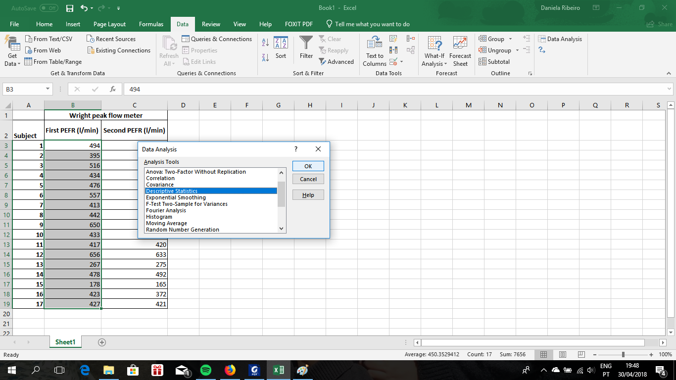
Then go to the "Data" tab on the Excel sheet and select "Data Analysis" - a new window will open and all you need to do is select "Descriptive Statistics".

The next window will require you to select the data you are interested in....

....And where you would like the output to be placed.
N.B. Don't forget to select "Summary Statistics" and "Confidence level of Mean".

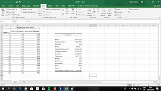
The results will be displayed as:
2. Graphics
Now let's say you have two measurements acquired with two different equipment for the same subject and you would like to display both measurements on the same graph.
There are many ways to do this but I find this to be the simplest way.... Without selecting any data, go to Insert>Charts and select the first graph for the 2-D Column.

The following window will appear ...
 DON'T WORRY, the empty window only means you haven't selected any data yet.
If you then click on "Select Data", the following will appear:

Now all you need to do is select the first data set you want to include in your graph...

...And repeat the process for the second data set....

Now that you have both data sets in your graph all you need to do is provide titles for the graph, xx axis and yy axis.

I hope these two examples were useful and even if you already knew about these functionalities, hopefully this will help you remember which buttons to click in order to get your results.
Daniela
The exam period finished today at 9am GMT time and it is now time to relax, at least until the marks are released :)
I thought it would be interesting to provide a few Microsoft Excel tips in today's post. When your taking a undergraduate and/or graduate degree, you often have to use Microsoft Excel however, this programme does have other useful functionalities appart from creating simple graphs.
For the purpose of these two examples represented below, I'll be using the data set presented by Bland and Altman in their paper "Statistical methods for assessing agreement between two methods of clinical measurement" (1).
1. Descriptive statistics
Let's say you have a sample of data and you would like to determine measures of central tendency, such as mean, median and mode and measures of dispersion, such as range and standard variance.
If you are working with Windows 10, you would first have to activate a few options:
File>Options>Add-ins

On the Manage drop down select Go (as visualised in the image) and ensure "Analysis ToolPak" and "Solver Add-in" are selected.
Then go to the "Data" tab on the Excel sheet and select "Data Analysis" - a new window will open and all you need to do is select "Descriptive Statistics".
The next window will require you to select the data you are interested in....

....And where you would like the output to be placed.
N.B. Don't forget to select "Summary Statistics" and "Confidence level of Mean".

The results will be displayed as:

2. Graphics
Now let's say you have two measurements acquired with two different equipment for the same subject and you would like to display both measurements on the same graph.
There are many ways to do this but I find this to be the simplest way.... Without selecting any data, go to Insert>Charts and select the first graph for the 2-D Column.

The following window will appear ...

If you then click on "Select Data", the following will appear:

Now all you need to do is select the first data set you want to include in your graph...

...And repeat the process for the second data set....

Now that you have both data sets in your graph all you need to do is provide titles for the graph, xx axis and yy axis.

I hope these two examples were useful and even if you already knew about these functionalities, hopefully this will help you remember which buttons to click in order to get your results.
Daniela
(1) Bland JM, Altman DG. Statistical methods for assessing
agreement between two methods of clinical measurement. Lancet. 1986 Feb
8;1(8476):307-10.

Comments
Post a Comment